The Key Difference Between Data & Data Visualization
As someone who works in data, I have always been into applying the skills I have developed at work into my personal life. When I started CrossFit back in 2016, I first started collecting my fitness data. I got to track progress as my back squat went from body weight to 1.5 times that, knowing exactly where I was each interval along the way.
When an Orangetheory Fitness opened up near me, I knew had to give it a try (girl who loves boutique fitness must try new boutique fitness). For those of you are unfamiliar with OFT, the workout uses a proprietary heart rate technology to project a user’s “zone” onto screens in the studio. Users move from the resting gray zone through to blue and green, then eventually orange and red. Workouts are gamified as attendies work toward 12 splat points, collected for every minute in the orange and red zones. At any given point in time, an athlete can look up to the OTV (Orangetheory TV) screen and see how they’re doing.
While the in-progress numbers on the screen can be reassuring, for a data-junkie like me, the best part is the after-workout report, distrubuted via email or the app affiliated with the heart rate monitor. I’ve been doing OTF to supplement my CrossFit workouts for nearly a year in that time I’ve seen some interesting data design decisions.
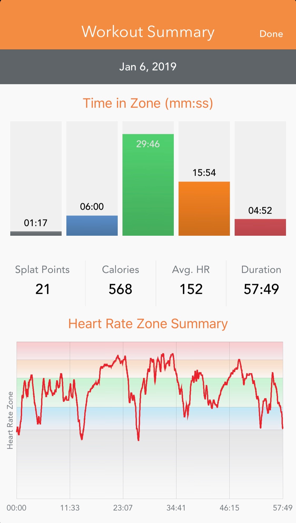
Here’s what the post-workout report used to look like.
I love this report, much like one I’d prepare for a stakeholder at work. This visualization is in three parts and each of them is effective in their own way.
The top third clearly answers a question- was that a good workout?- measured by the amount of time spend in each of the five zones. From here, I can dig in more- how much of the workout was I really pushing myself?- measured by time in the orange and red zones. I can answer a lot of questions at a glance from the five bars at the top of the screen.
The next third gives you a series of metrics at a glance- splat points collected, calories burned, average heart rate, and workout duration. These are pretty straight-forward. How many splat points did I collect? How many calories did I burn? What was my average heart rate? How long was the workout? These numbers are specific, and they only do one thing. They only answer these questions. They have one purpose and one purpose only.
The final third lets you track my heart rate over the course of a workout. You can see where I was really pushing myself, where I was just getting up to speed, and where I was just maintaining.
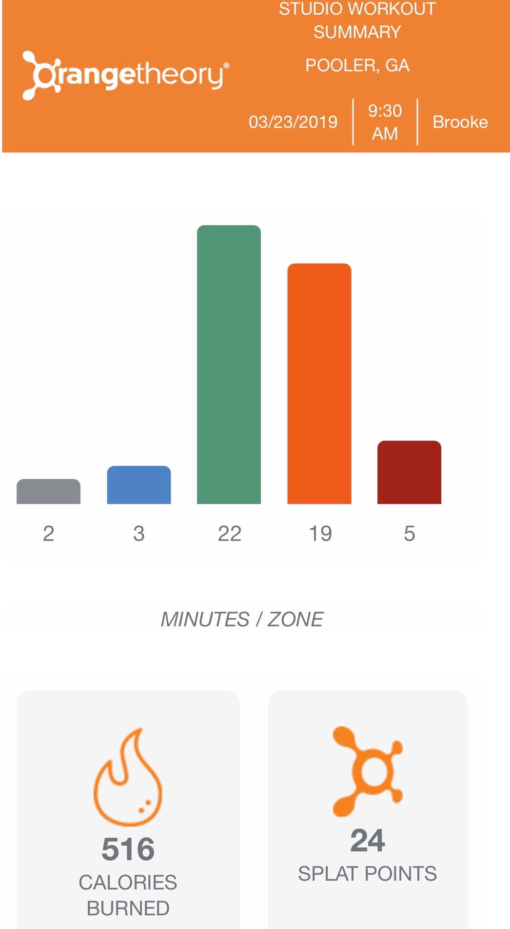
This is what the post-workout currently looks like.
This is a genuinely unfortunate change, but not unlike ones I’ve seen in the real world. In the same screen space, we’re now presenting less information than before and it’s less useful information.
As someone responsible for data analysis, your stakeholder will ask you for data. They’ll ask you for things like how many splat points you collected or how long the workout was. It can be natural to want to fulfill the ask.
As the data subject matter expert, though, it’s your responsibility to not just give them the data, but to give them the story behind the data- the data visualization. You see, in a silo, the data alone doesn’t do anything but answer one specific question. It doesn’t tell you where to focus, how to improve, or how you’re tracking. The answer to those questions all lie in the data visualization.
A couple of other lessons that the Orangetheory workout reports have reminded me of:
Don’t settle for just the data visualization you have right now. Make sure to zoom in and out as needed. It’s not just about how many splat points I collected in this class but how my splat points per class might be trending over the last quarter or year.
Enrich your data with other sources. After I started, they changed their formula for calculating heart rate zones. My “regular” splat point count is twice what it used to be before the formula change.
Try new things with your data visualizations. But be prepared to go back if you were wrong. The new Orangetheory report sucks. They would be best to back track or try something else out.
Own your data. If you’re thinking about applying these principles to something like your own personal data, make sure you are storing it somewhere outside of a proprietary software that your gym uses. After a year a half at my first CrossFit gym, we moved states and I lost all that data. Similarly, at work, make sure you’re not building your analyses in a place where you’re going to lose them if you switch tools. I manually put my Orangetheory metrics into a spreadsheet.
Measure twice. I wear both an Orangetheory monitor + an Apple Watch 3. Their results can be wildly different- even for metrics like “heart rate,” at any given point in time. Make sure you build some redundancy into how you’re tracking things.
Your stakeholders will ask you for data to answer their questions. Refuse to give it to them. Instead, give them stories that do much more. These stories will lead to better questions, more useful (and more insightful) analyses, and a more data-literate organization.


